Learn Mobile App Design: Process, Rules and Tools
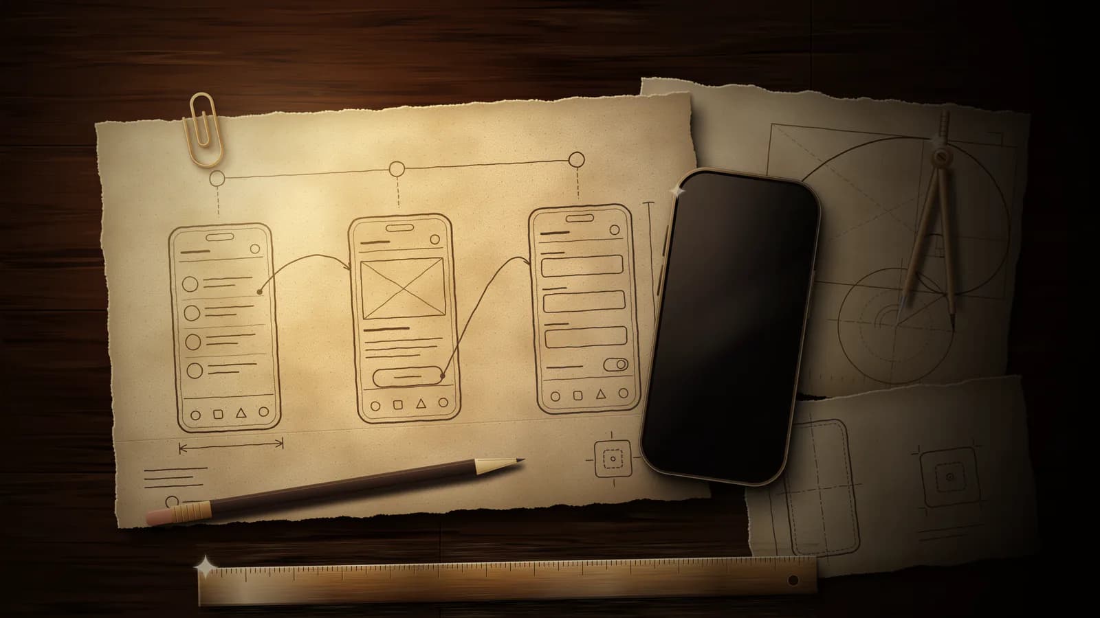
Mobile app design covers every decision you make before developers write code: who you design for, how they move through your app, what each screen shows, how it looks, and how it works for people of every ability on every phone. Work in this order: research, user flows, wireframes, interface (UI) design, a clickable prototype, testing with real people, an accessibility check, and a handoff to developers. Follow Apple's Human Interface Guidelines on iPhone and Material Design 3 on Android so your app feels familiar on each platform.
This guide zooms in on the design stage of how to make an app. Begin it once you have scoped your MVP.
Follow the mobile app design process in order
Each stage ends with something you can show a real person, and each stage feeds the next.
Research the people you design for
Write one sentence that names your audience and the task they need done. Then talk to people who match that sentence. Ask how they do the task today, which apps they use for it, and where those apps frustrate them. Download the closest competing apps and screenshot every step of their main flow. You now know what to match and where you can do better.
Map your user flows
A user flow is the path from opening your app to finishing one task. Draw it as boxes and arrows: each screen gets a box, each tap gets an arrow, each decision gets a fork. Start with your main task, then add sign-in, empty states and errors. Cut every step that does not move the person toward the goal.
Sketch wireframes before you choose colors
Wireframes are plain layouts: a box for each image, lines for text, a rectangle for each button. Sketch one per screen on paper, or draw them in our wireframe creator and connect the screens into a clickable flow. Keep everything black and white. Nielsen Norman Group notes that designers feel less attached to low-fidelity work, so they change it more readily, and that skipping interactivity leaves more time for the design itself.
Design the interface once the layout works
Now add type, color, spacing, icons and real copy. Use each platform's native components so your controls look and behave the way people expect. If you set custom type styles, Apple asks you to follow its recommended sizes: 17 pt by default and 11 pt at minimum on iOS (Apple's accessibility guidance). Write real copy into every screen, because placeholder text hides layout problems.
Build a clickable prototype
A prototype links your screens so a tester can tap through your flow. Make it realistic enough that people react to the real layout: Nielsen Norman Group lists a faster, more realistic system response as a benefit of high-fidelity prototypes and says they let you judge details such as type legibility. If you wonder whether to build a prototype or an MVP first, read our guide to prototype vs MVP.
Test with five people, then fix and test again
Put your prototype in front of five people who match your audience and watch each one try your main task. Note where they hesitate, tap the wrong thing or ask what a label means. Jakob Nielsen's analysis of many projects finds that a first study with five participants uncovers 85% of the usability problems. Fix them, then test the redesign. With budget for 15 testers, Nielsen suggests three studies of five people each. Once developers build your app, run the mobile app testing checklist on real devices.
Then run your accessibility pass and hand your designs to developers. Both sections follow below.
Adapt your design to iOS and Android
Apple and Google publish separate rulebooks: the Human Interface Guidelines for iOS and Material Design 3 for Android. Nielsen Norman Group's consistency heuristic tells you to follow platform and industry conventions, because people spend most of their time in other products and those products set their expectations. Match each platform where behavior matters, and keep your brand in your colors, type and tone.
Choose the navigation pattern each platform expects
On iPhone, a tab bar moves people between the top-level sections of your app. Apple asks you to keep it visible in every section, to leave tab buttons enabled even when a section is empty, to use single-word labels where possible, and to avoid overflow tabs that collapse into a More tab. Put actions in a toolbar.
On Android, a navigation bar sits at the bottom of the screen and holds three to five destinations, each with a label of one or two words. With more than five destinations, Material 3 points you to tabs or a modal navigation rail, and on expanded windows it asks for a navigation rail.
Hiding navigation has a cost. In a Nielsen Norman Group study of 179 participants on six sites, people on phones used hidden navigation in 57% of cases and combined visible and hidden navigation in 86%, and they finished tasks 15% slower with hidden navigation than with the combined version. Show your main sections.
Compare the two rulebooks side by side
Keep this table open while you design.
| Topic | Apple Human Interface Guidelines | Material Design 3 |
|---|---|---|
| Phone navigation | Tab bar for top-level sections | Navigation bar with three to five destinations |
| Navigation labels | Single words whenever possible | One to two words |
| Complex apps and large screens | Sidebar, or a tab bar that adapts to a sidebar | Navigation rail on expanded windows |
| Touch target size | 44x44 pt by default, 28x28 pt minimum | At least 48x48 dp |
| Space between targets | About 12 pt of padding around elements with a bezel | 8 dp or more |
Size your touch targets for both platforms
Apple's accessibility guidance sets the default control size on iOS and iPadOS at 44x44 points and the minimum at 28x28 points. Material 3 recommends touch targets of at least 48x48 dp, about 9 mm on any screen, and a 24x24 dp icon reaches that size through the padding around it. If you design one set of screens for both platforms, give every tappable element at least a 48x48 target. That size clears Apple's 44x44 default and matches Google's recommendation.
Respect each platform's back gesture
Apple notes that controls are easier to reach in the middle or bottom of an iPhone screen, and it asks you to let people swipe to navigate back (Designing for iOS). On Android, predictive back lets people preview where a back swipe leads before they commit, so keep touch gestures and drag targets out of the edge gesture areas.
Build accessibility into every screen
WCAG 2.2 became a W3C Recommendation on 5 October 2023, and the W3C publishes a draft note on applying it to mobile apps, including native and hybrid apps. Aim for Level AA and check every screen against this list:
- Text contrast: at least 4.5:1 between text and its background (SC 1.4.3), and 3:1 for large text, which means 18 point or 14 point bold. Apple lists the same ratios for iOS and asks you to check contrast in both light and dark appearances.
- Control and icon contrast: at least 3:1 against neighboring colors for the parts people need to identify a control and its state, and for graphics that carry meaning (SC 1.4.11).
- Target size: at least 24 by 24 CSS pixels for pointer targets at Level AA, unless enough space surrounds a smaller target (SC 2.5.8). Level AAA raises the size to 44 by 44 CSS pixels (SC 2.5.5).
- Text size: let people enlarge text to 200 percent without losing content or function (SC 1.4.4). Apple asks for at least 200 percent on iOS and points you to Dynamic Type.
- Color: never use color as the only way to convey information, indicate an action or tell two elements apart (SC 1.4.1). Apple suggests distinct shapes or icons as the second signal.
- Dragging: give each drag action an alternative that works with a single pointer, such as buttons that move an item up or down, unless the dragging itself is essential (SC 2.5.7).
- Screen readers: describe your interface and content for VoiceOver, and agree the reading order with your developers. Material 3 asks designers and developers to collaborate so the screen reader reads content in the intended order.
Turn on large text, Increase Contrast and a screen reader before you call a screen done.
Create a design system from reusable components
Nielsen Norman Group defines a design system as a set of standards for managing design at scale, with less redundancy and a shared language and visual consistency across channels. Its repository often holds a style guide for your colors and type, a component library of reusable elements such as buttons, inputs and cards, and a pattern library of the layouts you repeat. You do not need a large one. Start with your colors, type styles, spacing and the components in your first flow.
Material 3 design tokens put the idea into practice: reusable design decisions with self-explanatory names. Material groups them into reference, system and component tokens. Name your colors by role, such as primary action, so one change updates every screen.
Start from the platform kits. Apple Design Resources include a UI kit and an app icon template for iOS and iPadOS, and Google offers an M3 Design Kit for Figma. Then name every state each component needs: default, pressed, focused, disabled, loading and error.
Hand your designs to developers without gaps
Give your developers what they need to build each screen without guessing:
- Your user flow, so they see how the screens connect.
- Every screen in every state: loading, empty, error, offline and success.
- Spacing, sizes, colors and type styles as tokens from your design system.
- Your icons and images as export files, plus your real copy for every label and message.
- Accessibility notes: labels for controls and images, reading order, and which text scales.
- A link to your clickable prototype, so they see every transition.
Write down what counts as done in a requirements document with acceptance criteria, and scope your first release with our MVP guide. Review the first screens your developers build as soon as they run, then check them in portrait and landscape, in Dark Mode and with large text. Apple asks iPhone apps to adapt to device orientation, Dark Mode and Dynamic Type.
Avoid these common mistakes
- Tiny touch targets. Give every tappable element at least 48x48.
- Hidden navigation. Show your main sections in a tab bar or navigation bar.
- Disabled or hidden tabs. Keep every tab button visible and explain why an empty section has no content, as Apple asks.
- One platform's pattern on the other. Use a tab bar on iOS and a navigation bar on Android, with each platform's labels and back behavior.
- Weak contrast. Check every text and background pair against 4.5:1 and every control against 3:1.
- Too many controls. Apple asks you to limit onscreen controls and make secondary actions discoverable with minimal interaction. Move extras to a second layer.
- One test at the end. Run several small tests while you design.
- Only the happy path. Design the empty, loading, error and offline state of every screen.
Pick tools that fit each step
- Pen and paper: sketch your flows and first wireframes.
- Our wireframe creator: draw screens, connect clickable flows and export SVG, PNG or a project file.
- A design app: build your interface and start from Apple's UI kit or the M3 Design Kit for Figma.
- Our free app mockup generator: drop your screenshots into iPhone, Android or tablet frames and download store-ready JPEGs or social PNGs.
- Real phones: run every test on them, old and new.
Work with a studio from the first sketch
A studio can take over any stage of your app design, so decide which stages you keep. Bring a short brief and ask each studio:
- Who designs and who builds my app?
- What do I receive at each stage: flows, wireframes, a prototype, a design file with components, developer specs?
- Who owns the design files, the code and the developer accounts at the end?
- How and when do you test with real people?
- How do you apply the iOS and Android guidelines to my screens?
Design your app with Doved Studio
If you have your user flow, your wireframes and your list of must-have screens, bring them to Doved Studio. We combine product scoping, design and development for iOS, Android and web in one studio, from prototype to MVP to production, and we transfer the code, accounts and product ownership to you. Send your flow and the screens you cannot launch without, and ask us the five questions above.
Common questions
What touch target size should you use?
Use at least 48x48 for every tappable element. Apple's default control size on iPhone is 44x44 points, Material 3 recommends at least 48x48 dp, and WCAG 2.2 Level AA asks for at least 24 by 24 CSS pixels for pointer targets, with a few exceptions. Nielsen Norman Group recommends at least 1 cm by 1 cm (Touch Targets on Touchscreens).
How many people do you need for a usability test?
Test with five people per round and run several rounds. Nielsen's analysis finds that five participants uncover 85% of the usability problems in a first study, so fix those problems and test the redesign again.
Do you need separate designs for iOS and Android?
Share your brand, your flows and your copy across both platforms. Adapt navigation, touch target sizes, back behavior and system controls to each platform's guidelines, because people compare your app with the other apps on their phone. Your build approach decides how much code you share, so read our guide to native vs cross-platform before you commit.
Which contrast ratio does your app need?
Text needs at least 4.5:1 against its background at WCAG 2.2 Level AA. Large text (18 point, or 14 point bold) needs at least 3:1, and so do the visual parts of controls and the graphics that carry meaning.
Sources
- Apple Developer. Human Interface Guidelines
- Apple Developer. Human Interface Guidelines: Accessibility
- Apple Developer. Human Interface Guidelines: Tab bars
- Apple Developer. Human Interface Guidelines: Designing for iOS
- Apple Developer. Apple Design Resources
- Material Design 3. Home
- Material Design 3. Accessibility designing
- Material Design 3. Navigation bar
- Material Design 3. Design tokens
- Material Design 3. Get started
- Android Developers. Predictive back design
- W3C. What's new in WCAG 2.2
- W3C. Guidance on Applying WCAG 2.2 to Mobile Applications
- W3C. Understanding SC 1.4.3 Contrast (Minimum)
- W3C. Understanding SC 1.4.11 Non-text Contrast
- W3C. Understanding SC 2.5.8 Target Size (Minimum)
- W3C. Understanding SC 2.5.5 Target Size (Enhanced)
- W3C. Understanding SC 1.4.4 Resize Text
- W3C. Understanding SC 1.4.1 Use of Color
- W3C. Understanding SC 2.5.7 Dragging Movements
- Nielsen Norman Group. 10 Usability Heuristics for User Interface Design
- Nielsen Norman Group. Testing with five participants (Jakob Nielsen)
- Nielsen Norman Group. Hamburger Menus and Hidden Navigation Hurt UX Metrics
- Nielsen Norman Group. Touch Targets on Touchscreens
- Nielsen Norman Group. Design Systems 101
- Nielsen Norman Group. UX Prototypes: Low Fidelity vs. High Fidelity
